

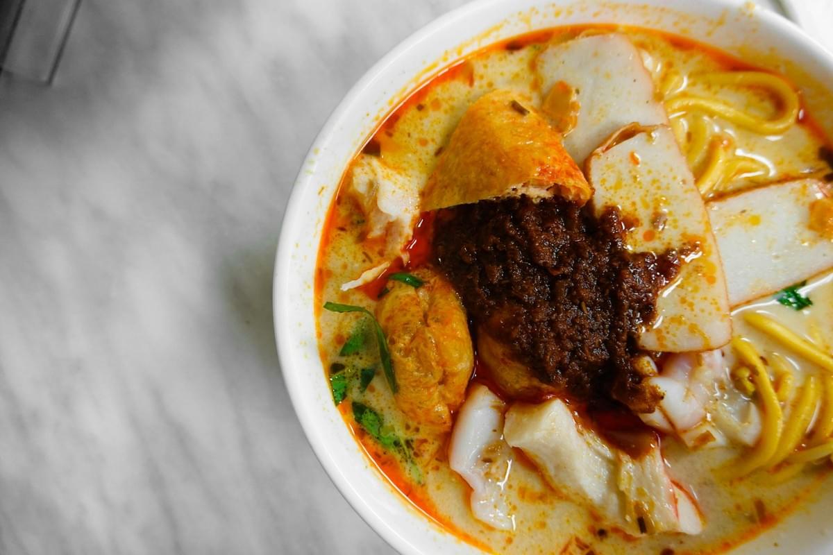
The first AI image I ever made for a client was a bowl of laksa.
It looked stunning at first glance. Rich broth, a swirl of steam, prawns catching the light. I was proud of it for about ten seconds.
Then I looked closer. The spoon wasn't resting in the bowl. It was passing through it. The chopsticks floated just above the noodles, touching nothing. And the little dish of sambal beside it cast a shadow in the wrong direction, as if lit by a sun that didn't exist.
Beautiful, and completely wrong.
That's the strange thing about AI food images and AI food photography platforms. They can fool you for a moment and fall apart the second you actually look. Over the years I've learned that the real work isn't generating the image. It's inspecting it.
Overcrowding the Frame
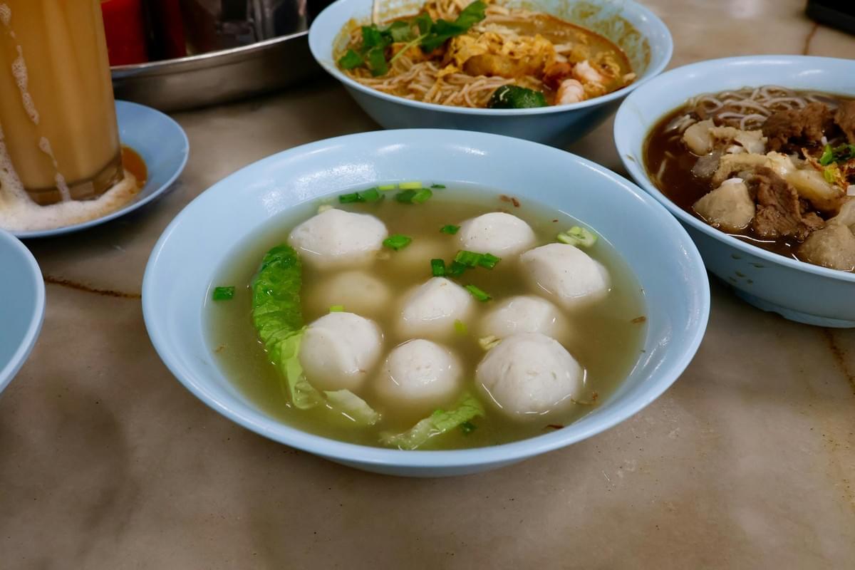
AI loves to fill a table. Ask it for "a Singapore restaurant spread with chicken rice, laksa, satay, chilli crab, iced kopi, dumplings, flowers, and people dining," and it will try to give you all of it at once.
The result is usually a mess. Dishes merge into each other. Spacing goes strange. Nothing feels like it belongs on the same table.
I've found the fix is restraint. Start with one hero dish, add a single supporting object, then a soft background, then atmosphere. Build slowly. A bowl of laksa in the foreground with a small spoon of sambal to its right and a quiet kopitiam behind it reads far better than a table trying to hold ten cuisines.
Forgetting the Focal Point
A good food photographer decides what you should notice first. AI often forgets to decide anything, so everything competes for your eye at once.
Before you accept an image, ask yourself one question: what am I supposed to look at? If you can't answer in a second, the composition isn't done.
I think of it as a quiet hierarchy. The dish comes first. The relevant props come second. The environment sits gently in the back. When a plate of chicken rice shares equal weight with a candle, a napkin, and a background diner, none of it lands.
Spatial Relationship Errors
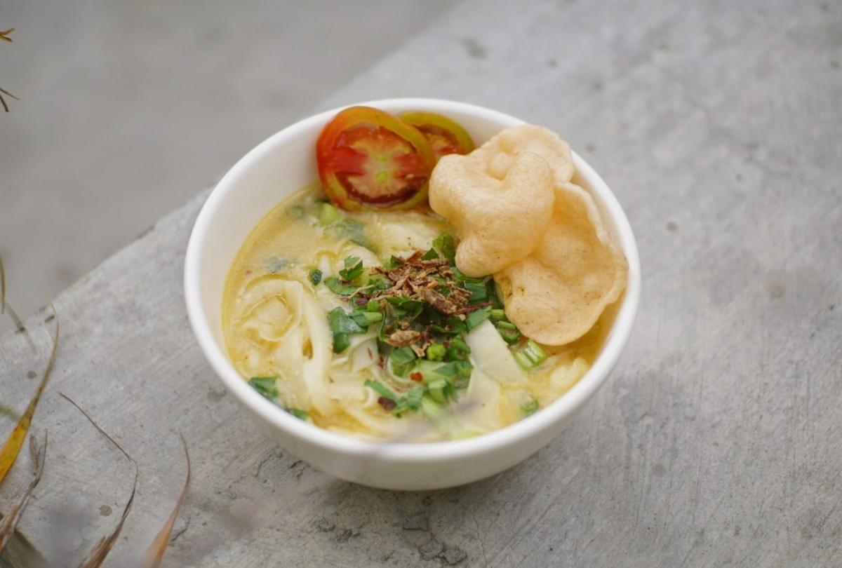
This is the one that catches everyone. AI doesn't build a table the way a photographer does. It stitches together learned patterns, so objects don't always obey physics.
I've seen fork handles vanish beneath plates, bowls overlap in impossible ways, and garnishes sitting on top of the wrong dish entirely. The image looks convincing until you trace each object.
So trace them. Where is this sitting? What is it touching? What's behind it, and what's in front? Where does its shadow fall? If you can't answer those visually, don't publish it yet.
Insider knowledge: Follow the shadows first. They're the fastest tell. A dish lit from the left with a shadow falling left means the whole scene is unreliable, no matter how pretty it looks.
The Wrong Camera Angle
AI drifts toward angles that look dramatic rather than angles that serve the food. A moody low shot might feel cinematic, but it can hide the very thing you're selling.
Different dishes want different viewpoints. Bowls of laksa or soup noodles usually open up at 45 degrees. Flat spreads and arranged sets often work overhead. A tall glass of iced kopi looks best at eye level or slightly below. Layered burgers want 45 degrees or a touch lower.
In my experience, if you don't specify the angle, AI will pick the prettiest one, and the prettiest one often shows the least food.
Perspective That Doesn't Make Sense
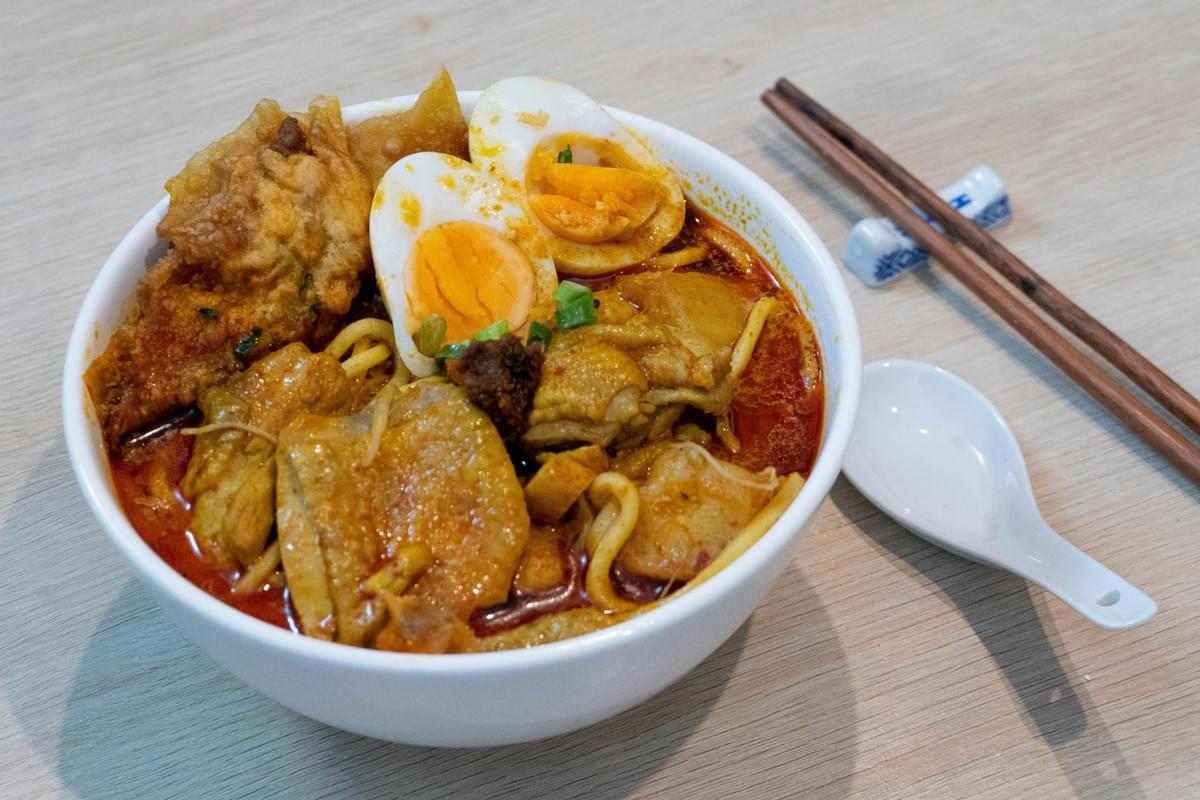
Here's a subtle one. AI can place objects at scales that quietly break reality. A coffee cup nearly as large as a plate. A lime the size of a bowl. A spoon too short to ever reach the food. A background diner looming far too large.
The trick I use is to look at objects with known sizes. A spoon, a pair of chopsticks, a glass, a standard plate. If their proportions feel off against each other, the whole composition is unreliable, even when the textures are flawless.
Symmetry Just Because It Can
AI adores symmetry. Perfectly centered bowl, identical chopsticks on each side, garnish spaced with a ruler's precision.
The problem is that real food photography rarely looks like that. Perfect symmetry reads as generated rather than photographed. Human photographers use gentle asymmetry to create movement and lead your eye.
I'd suggest aiming for a frame that feels intentionally balanced, not mathematically balanced. The difference is quiet, but people feel it even when they can't name it.
Prop Overload
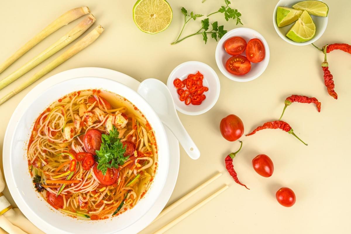
Because attractive food photos statistically include napkins, boards, herbs, candles, and cutlery, AI piles them on. The dish ends up buried under styling.
My rule is simple. Every prop has to earn its place by answering one question: does this help tell the story of the food? A sprig of coriander beside laksa, fine. Three candles, a linen runner, and scattered chillies around a humble bowl of fishball noodles? Remove them. You're making people fight through decoration to find dinner.
Treating Negative Space as Empty Space
AI wants to fill the frame. That's a problem when you need room for a headline, a price, a logo, or promotional copy.
Instead of "beautiful bowl of laksa," try describing a layout: "bowl of laksa in the lower-right third, generous clean negative space on the left for text, shallow background, 4:5 vertical." You stop asking for a pretty picture and start directing a composition.
Pro tip: Decide where your text goes before you generate. Empty space you plan for is design. Empty space you discover later is luck.
Forgetting the Final Platform
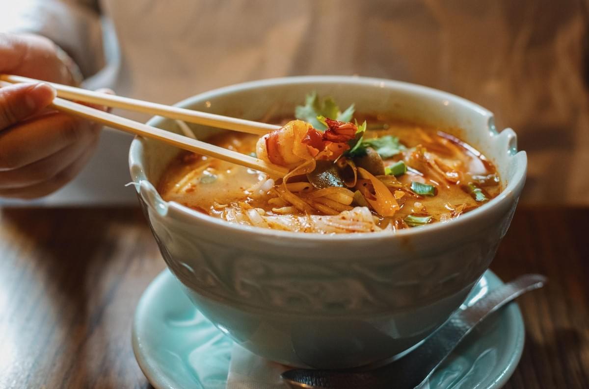
An image can have lovely composition and still be useless once cropped. A Singapore restaurant might use the same photo for Instagram feed, a Reel cover, a delivery listing, a website banner, and a printed menu. Those are wildly different shapes.
Decide the destination first. Instagram feed leans 4:5, Stories and Reels want 9:16, website heroes suit 16:9, square assets sit at 1:1. Compose for that format from the start. Don't generate a gorgeous square and hope it survives the crop into a vertical ad. It usually won't.
The Wrong Depth of Field
AI has learned that heavy background blur looks professional, so it blurs almost everything. But a plate of chicken rice needs its details to stay legible: the chicken skin, the rice grains, the cucumber, the chilli, the little bowl of soup.
Blur all of that away and you've lost the dish. Ask for selective focus instead: "shallow depth of field, but the entire main dish and garnish stay clearly detailed." The goal is a soft background, not a vanished meal.
Backgrounds That Don't Belong
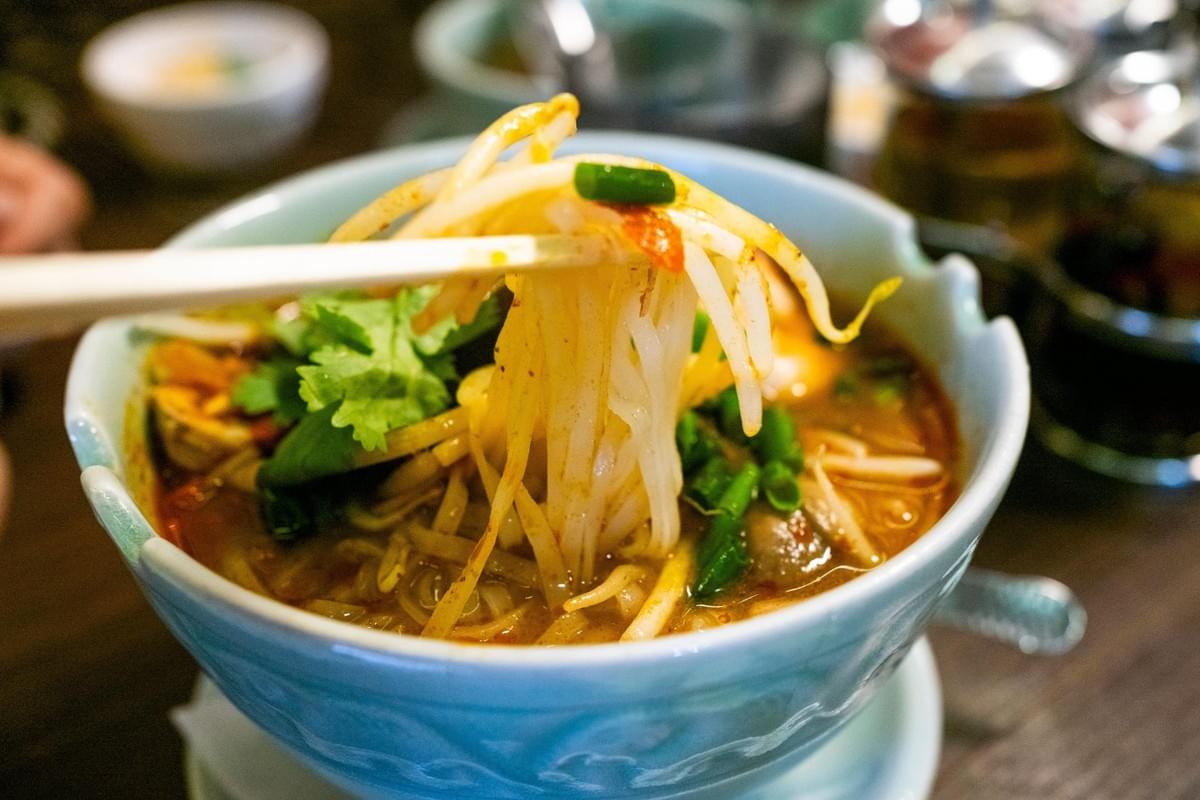
AI can invent a beautiful background that makes no cultural or physical sense. Watch especially for generic "Asian restaurant" interiors, muddled décor that mixes Chinese, Malay, and Japanese cues at random, impossible hawker-centre layouts, and invented signage.
A generated "Singapore hawker centre" is not automatically an accurate one. If you're representing your actual premises, this matters enormously. Customers here know exactly what a real hawker centre looks like, and they notice when it's fiction.
Text and Signage Errors
Text is still one of the weakest links. From a distance, AI signage can look convincing. Zoom in and you'll find misspelled names, fake Chinese characters, duplicated words, distorted logos, and prices that make no sense.
Never trust generated text just because it reads at a glance. Check the restaurant name, the dish name, the price, the logo, any Chinese, Malay, or Tamil wording. For real commercial work, add critical text and branding by hand wherever you can.
Hands That Are Almost Right
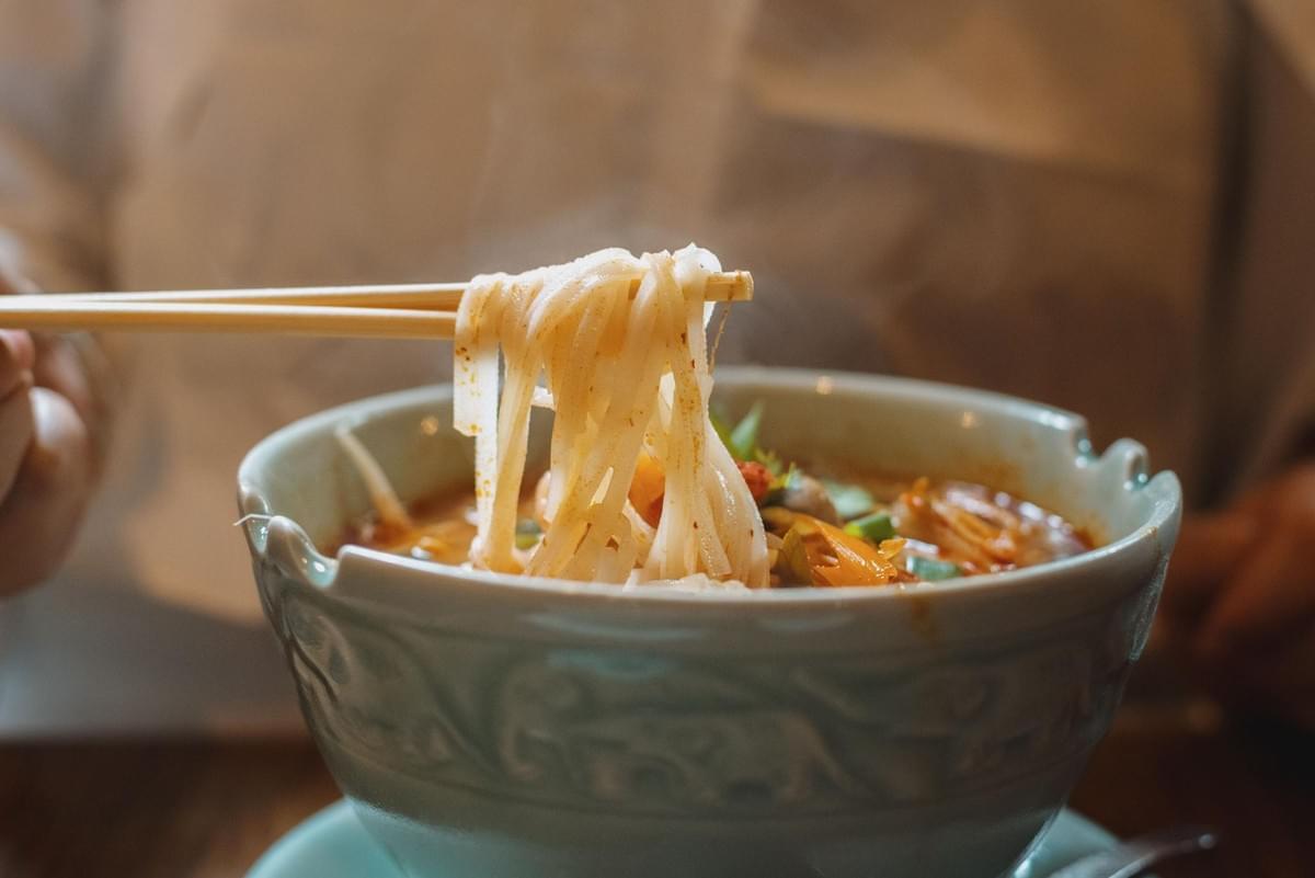
The classic weakness hasn't fully gone away. When you ask for human interaction, pouring sauce, lifting noodles, holding a cup of kopi, hands can still betray you: extra fingers, fused knuckles, an impossible grip, a utensil passing straight through a thumb.
Restaurants love that human touch, so this comes up often. Whenever there's a person in the frame, zoom into the hands before you approve anything. It's the fastest way to catch an image that would embarrass you later.
Food That Couldn't Physically Exist
This one matters more than fingers, honestly. AI can make food that looks delicious but doesn't behave like food. Noodles fused into a single mass. Rice that reads as one solid texture. Soup that looks set like jelly. Steam drifting sideways with no logic. Condensation on the wrong side of a glass.
This is where knowing food becomes your best quality-control tool. A cook will spot a wrong cut of meat or impossible plating that a general marketer scrolls right past.
Singapore's Own Lighting Traps
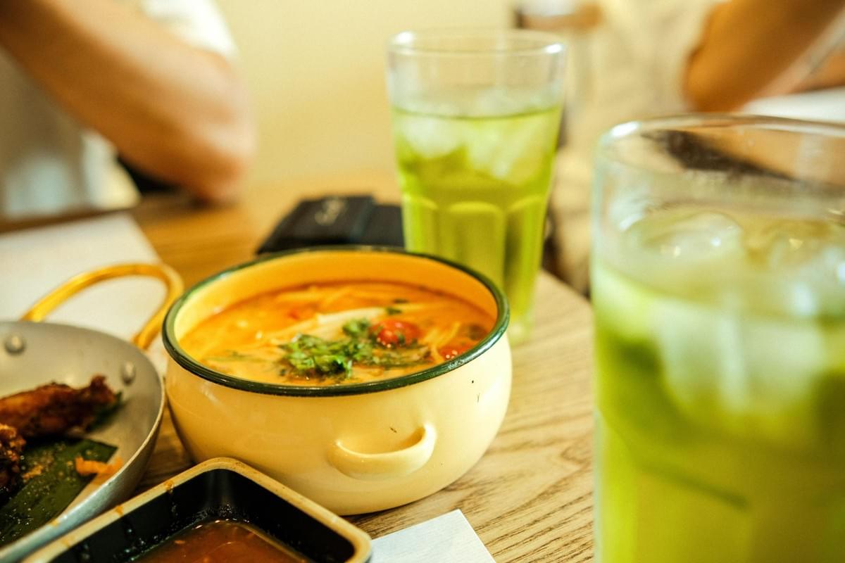
Two things trip up local images especially.
First, our tropical daylight is harsh. Ask for a "bright sunny Singapore restaurant" and you often get blown highlights and hard shadows. Describe the quality of light instead: "soft diffused tropical daylight from a side window, gentle shadows, controlled highlights." Morning and late-afternoon light are your friends.
Second, our restaurants mix light sources constantly — daylight, warm decorative bulbs, cold overhead tubes. AI reproduces the resulting mess: blue plates beside orange ones, warm shadows under cool highlights with no believable source. Watch for it.
And remember context. A plate of hawker chicken rice photographed like fine dining feels dishonest. Let the composition reflect where the food is actually eaten — on a tray, under practical light, in a place people recognize.
A Simple 7-Step Composition Workflow
This is the order I work in now.
- Define the hero. Write down what the viewer must notice. "The laksa." Not "a beautiful food scene."
- Choose the platform. 4:5, 9:16, 1:1, or 16:9, decided before you generate.
- Set the camera position. Overhead, 45 degrees, eye level, low, or close-up.
- Describe spatial relationships. "Bowl in foreground, drink behind it, chopsticks resting diagonally beside it, negative space on the left."
- Generate several variations. Never accept the first result on reflex.
- Run a physical reality check. Perspective, shadows, scale, contact points, hands, food structure.
- Crop it before approving. Drop it into the real post or menu layout. Full-screen beauty means nothing if it dies in the crop.
The 30-Second AI Composition Audit
Before anything goes live, run these ten quick checks:
- Hero: What do I notice first?
- Scale: Are objects proportional to each other?
- Perspective: Do they share one viewpoint?
- Contact: Is everything actually touching what it seems to touch?
- Shadows: Do they agree with the light source?
- Depth: Do foreground and background behave correctly?
- Hands: Are fingers and grips believable?
- Food: Could this dish physically exist?
- Text: Are names, prices, and signage correct?
- Crop: Does it survive its final format?
Fail one major physical check, and you regenerate or edit. No exceptions.
Before You Publish
That first laksa taught me something I still carry. The mistake was never that AI made an ugly image. It made a lovely one that happened to be impossible — as long as consistency in AI-generated food photography is present.
For Singapore F&B, that gap matters more than most places. Our food carries culture, memory, and a portion size people expect to actually receive. An image that lies, even beautifully, costs you the one thing you can't regenerate: trust.
So use these tools. They're genuinely helpful. But look closely, trace every object, follow the shadows, and keep the food honest.
The camera never lied by accident. AI does. Your job is simply to catch it before anyone else does.
